Luxcellent
Luxcellent, an online luxury re-commerce store, is undergoing a website renovation. Leveraging my experience there, I'm applying my insights to assist in the redesign process. The primary focus is to attract users to the live streams, with a preference for a clean and simple design approach. This project also explores how small interaction details can make the browsing and shopping experience feel smoother and more engaging.
General info
Problem
Statement
&
Goals
Problem statement
The client needs a completed website to grow the business, focusing on drawing users to the live stream platforms. E-commerce services will need to be provided. Also, there is no mobile version of the design.
Goals
- Coming up with creative solutions to encourage users to watch live streams to meet the business goal
- Making sure the new website is responsive
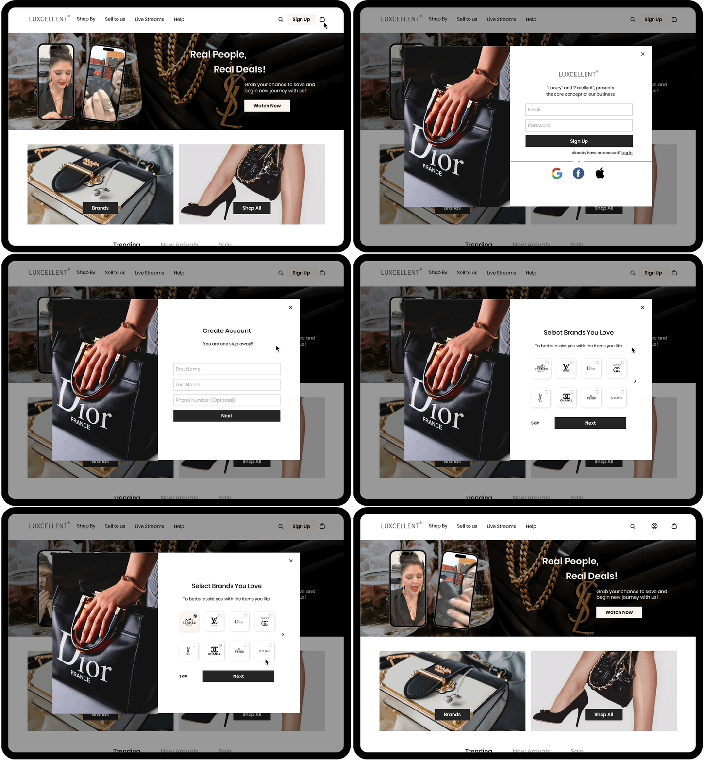
- Design a seamless user onboarding experience
- Designing Purchase — not including Checkout
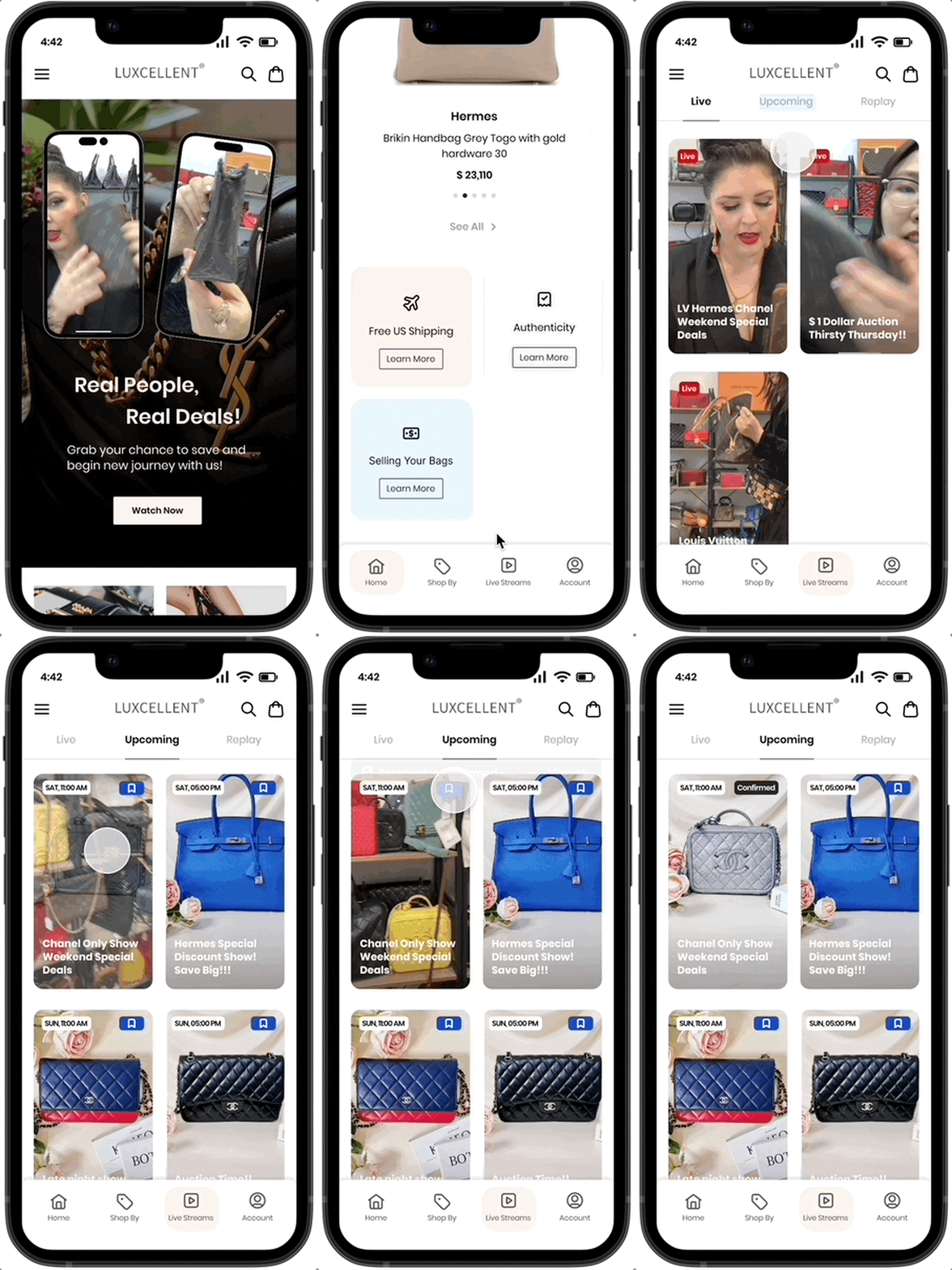
- Designing a Live Stream page (with the past, ongoing, and future)
01 Research
Research plan
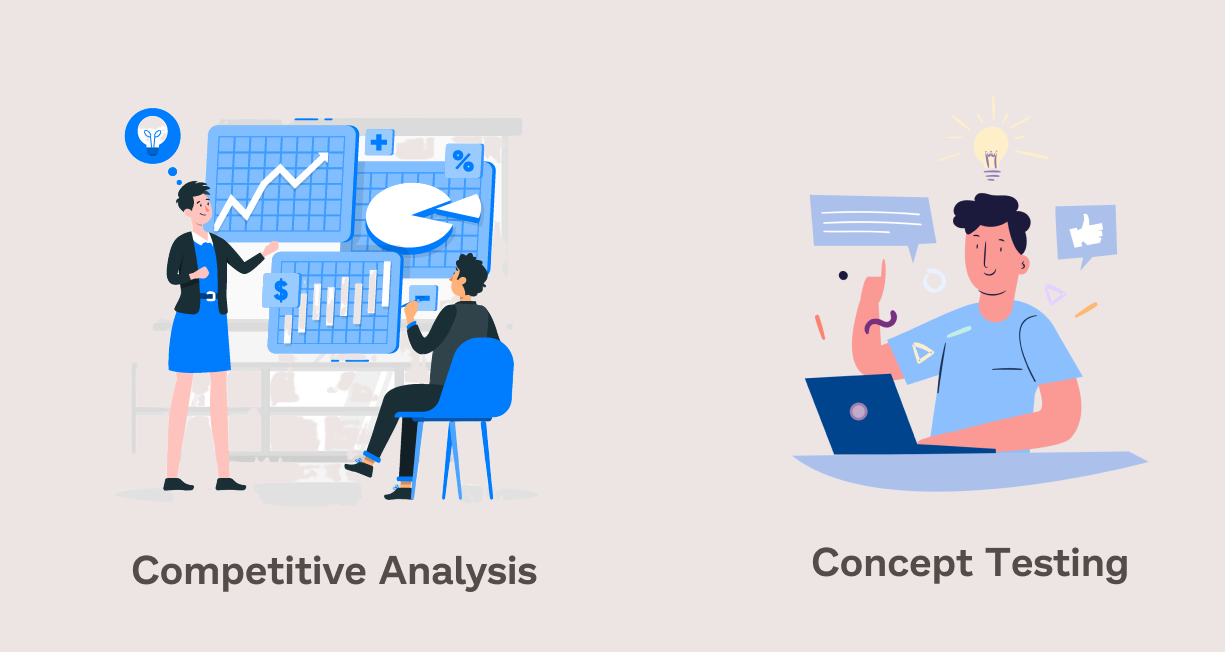
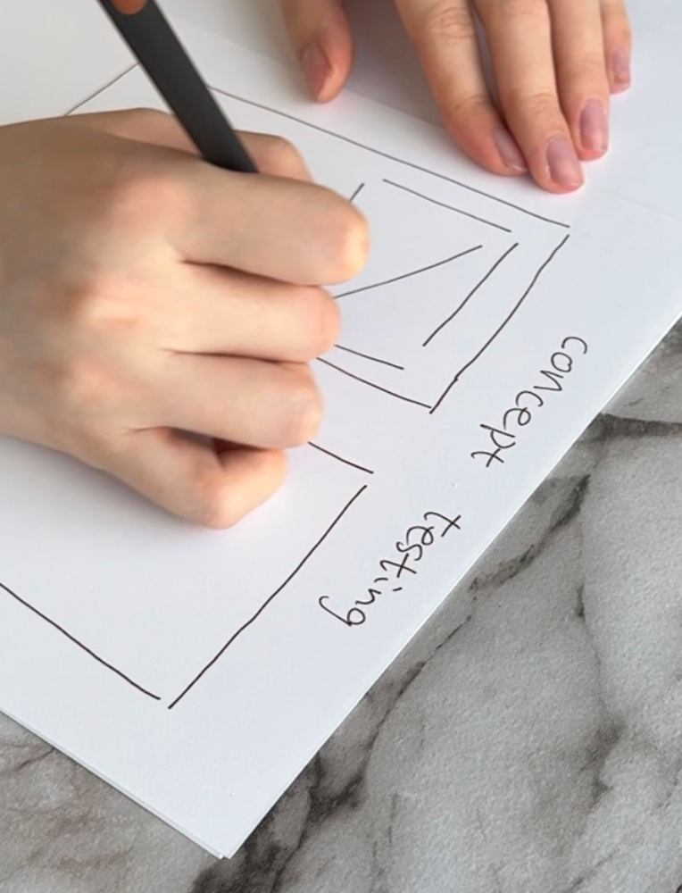
After defining the project's problem and goals, I outlined research objectives and formulated research questions to guide my choice of methodologies. I decided to use competitive analysis and concept testing for research methodologies. Using concept testing allows me to engage participants early for insights before advancing to the next stages.
Ideal participants for this phase included those experienced in online shopping, live streaming, and interested in the preloved market.
Competitive analysis
By researching similar online luxury preloved/live stream websites, I compared features and services they provided. By doing this, I found areas of opportunity. I analyzed several competitors, such as Rebag, The Realreal, Fashionphile, Shopshop, and Whatnot. I made my analysis based on the features they have, their target users, promotions marketing, and overall user interface.
Research finding
After researching our competitors' features, I observed that only "Whatnot" and "ShopShops" have dedicated live-streaming pages. The inclusion of ongoing live streams on the homepage and the option to reserve products stand out as valuable reference points for our upcoming steps.

I also noted varying layouts for the sign-up page, homepage, purchase page, and live stream page among our competitors. As a response, I have designed two versions for each of these pages. These designs will serve as a foundation for initiating my concept testing phase.
Concept testing
I designed 2-4 versions for the sign-up, home, purchase, and live stream pages. Using concept testing, I was able to get in-depth insights into different aspects of my ideas.
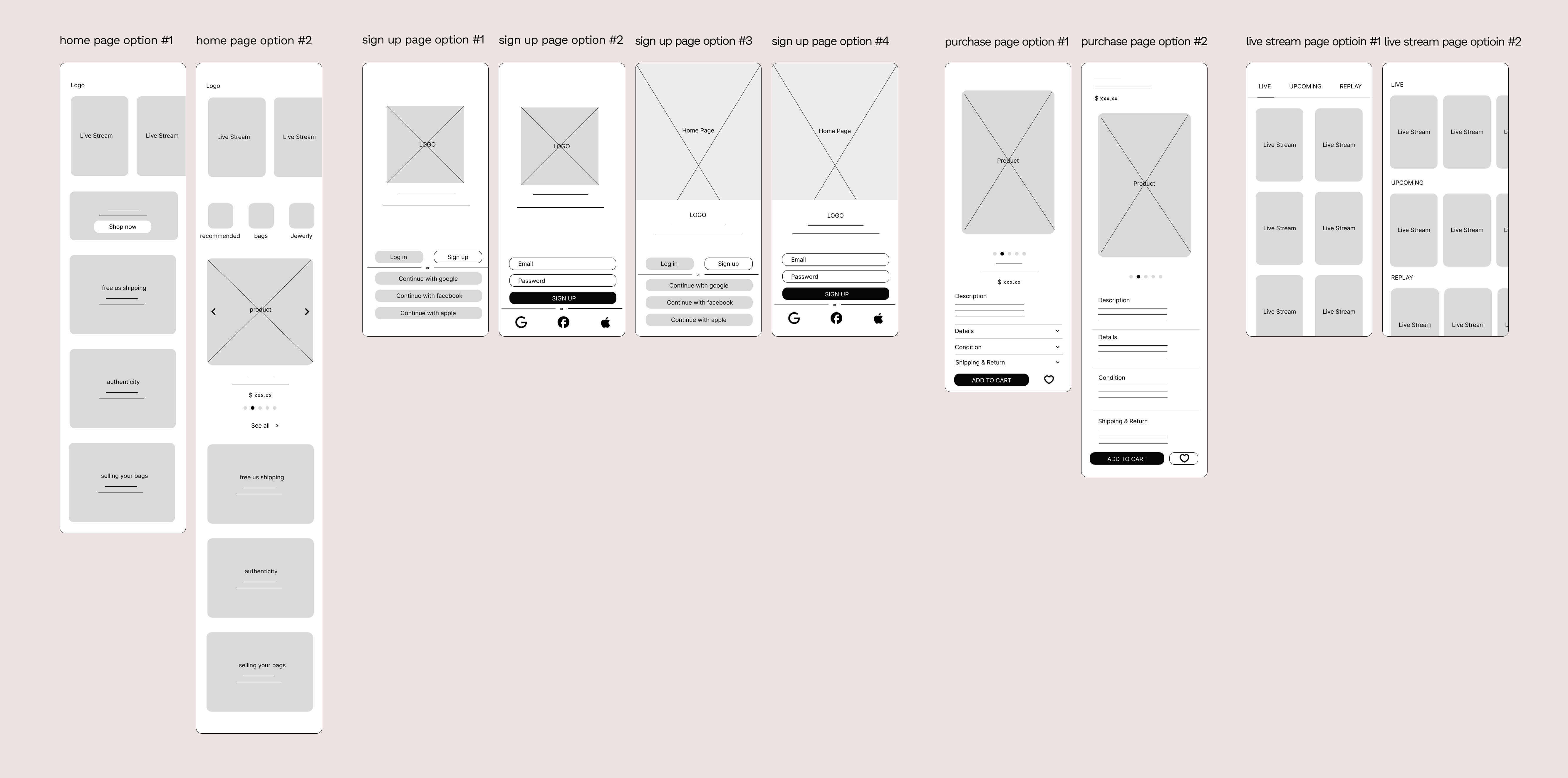
I had a total of 5 participants to answer my questions. I asked them questions about look, feel, layout, user ability, specific features, and which one they prefer. I organized my research findings from this exercise by completing an affinity map.
Affinity mapping
I had a total of 5 participants and organized their reasons for liking/disliking each design into an affinity map. Their goals and pain points for using a similar online shopping website are also included.
From making the affinity map, I was aware of what changes to keep/make in my designs.

Research findings
Goals
- Get better promotions from shopping online.
- The other type of people are those who are clear with what they want to purchase and they want to be convenient and save time from shopping online.
Pain points
- The biggest pain point is the return process. This would stop participants from checking out.
- Worries about the quality/ authenticity of the products.
- The promotion is not good enough, waiting for more discounts.
- Live streams take too long, users have to wait until the host talks about the item they like.
I will use sign up page option #4, home page option #2, purchase page option #1, and live streams page option #1 in my next designs.
02 Ideate
Personas
Based on my findings, I created 2 personas to represent my target users. Creating personas allows me to form a deeper understanding of our users' goals, needs, experiences, and behaviors. These 2 personas represent two types of groups
- The first groups are confident splurgers who are financially stable, have a clear mind of what to purchase and want to save time on the purchase process.
- The other types of people are indecisive and always waiting for a discount.

How might we statement
To get started in forming solutions, I used a “how might we…” framework centered around the user and business goals.
- HMW makes it easier for busy people to sort through products that they like on a live stream?
- HMW provides an option for users who watch live streams to shop online efficiently?
- HMW design an experience where they can get assured of authenticity?
- HMW makes it easier for budget shoppers to sort through the many products?
- HMW makes it easier for discount-seekers to find discounts and make a purchase?
- HMW makes it more seamless for a discount shopper to purchase?
Insights → Actions
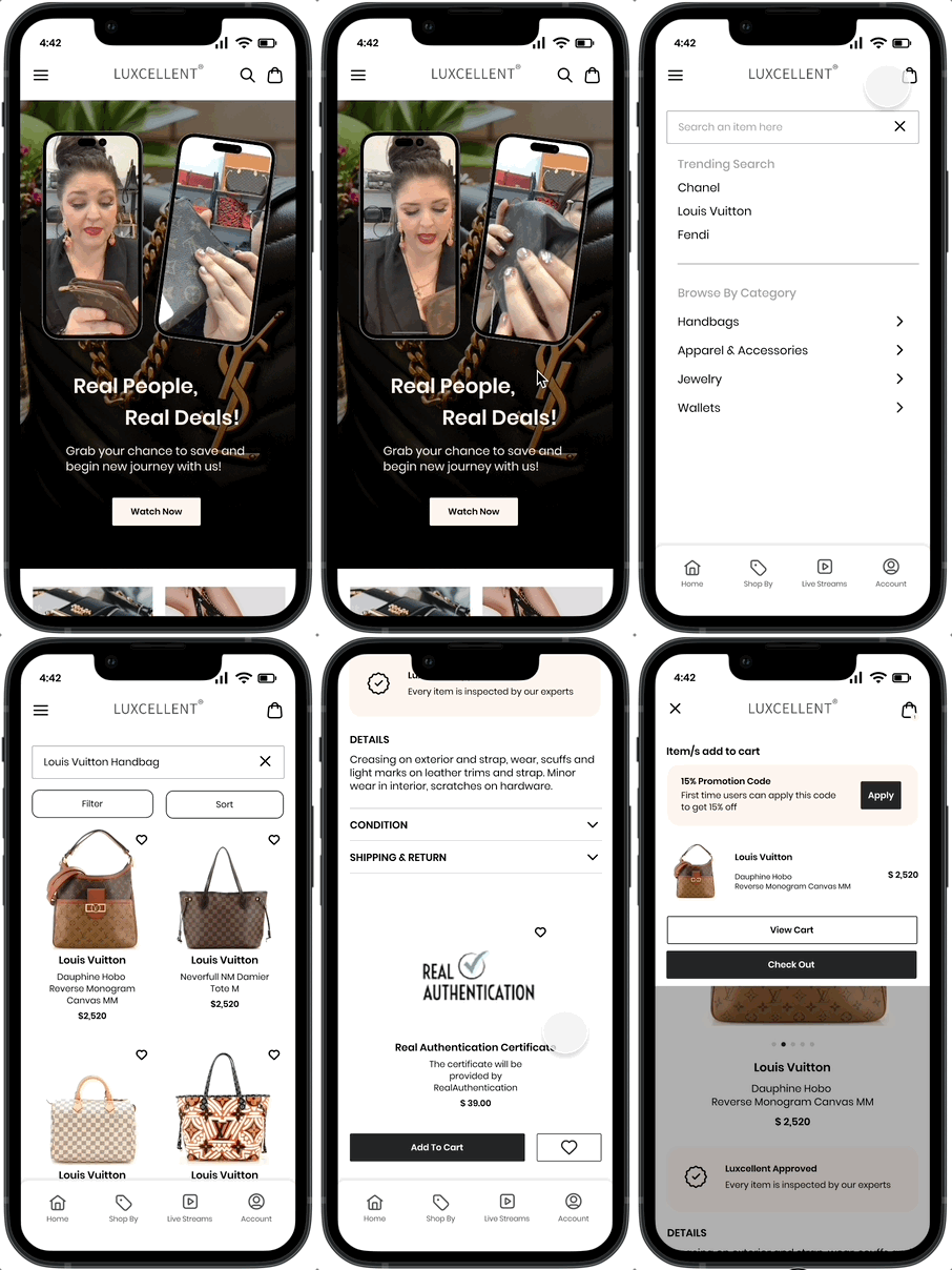
- Users worried about product authenticity and quality → Added an authentication option on the product page to build trust.
- Users missed purchase opportunities while waiting for bigger discounts → Added an automatic promotion banner that appears after adding an item to the cart.
- Users who already know what they want prefer a faster, more convenient shopping process → Added a sign-up question about favorite brands to personalize their experience.
- Budget-conscious users wanted more ways to browse and compare products → Added filtering options to help them find what they need faster.
- Indecisive discount shoppers needed more motivation to complete their purchase → Displayed the number of users currently viewing an item to create urgency and encourage checkout.
Sitemap
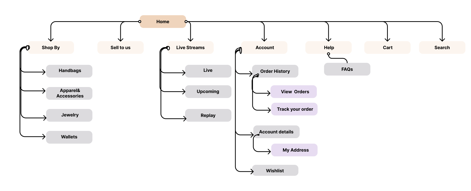
I sticked with what Luxcellent has so far for their website and added a help page on the navigation bar. I also specified what live stream and account page should have under their pages considering the owner's business goals.
Task flow
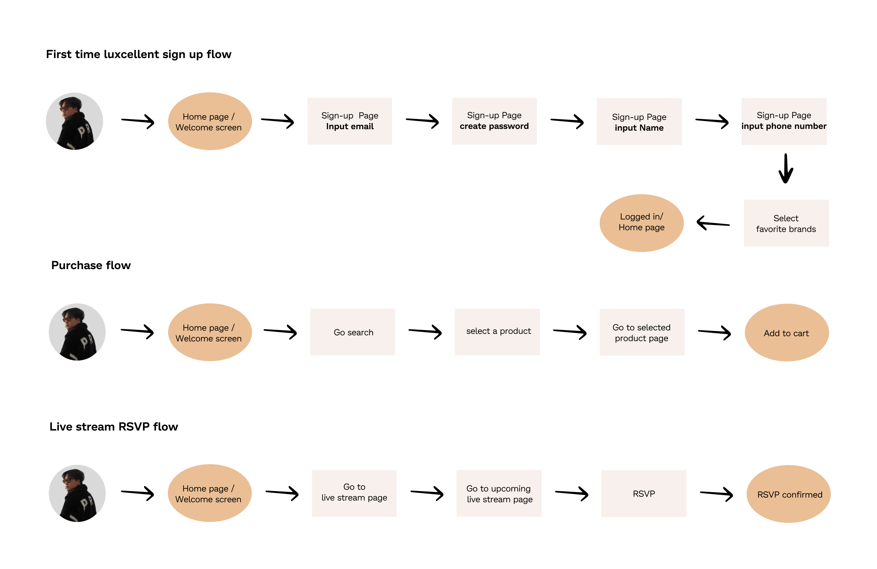
My three flows are:
- The first-time user sign-up for Luxcellent flow
- The purchase flow (before checkout)
- The upcoming live stream page reservation flow
I tried to focus on the gender flow users would take to complete the tasks without the potential other paths they might take. And this helps with the next step - wireframes.
03 Design
Moodboard
Based on the client's request, they wanted to have a simple and clean style for the site. So I have looked up some similar luxury e-commerce sites and decided to use them as my inspiration for my next step in UI design. I want to keep a chic and premium vibe.

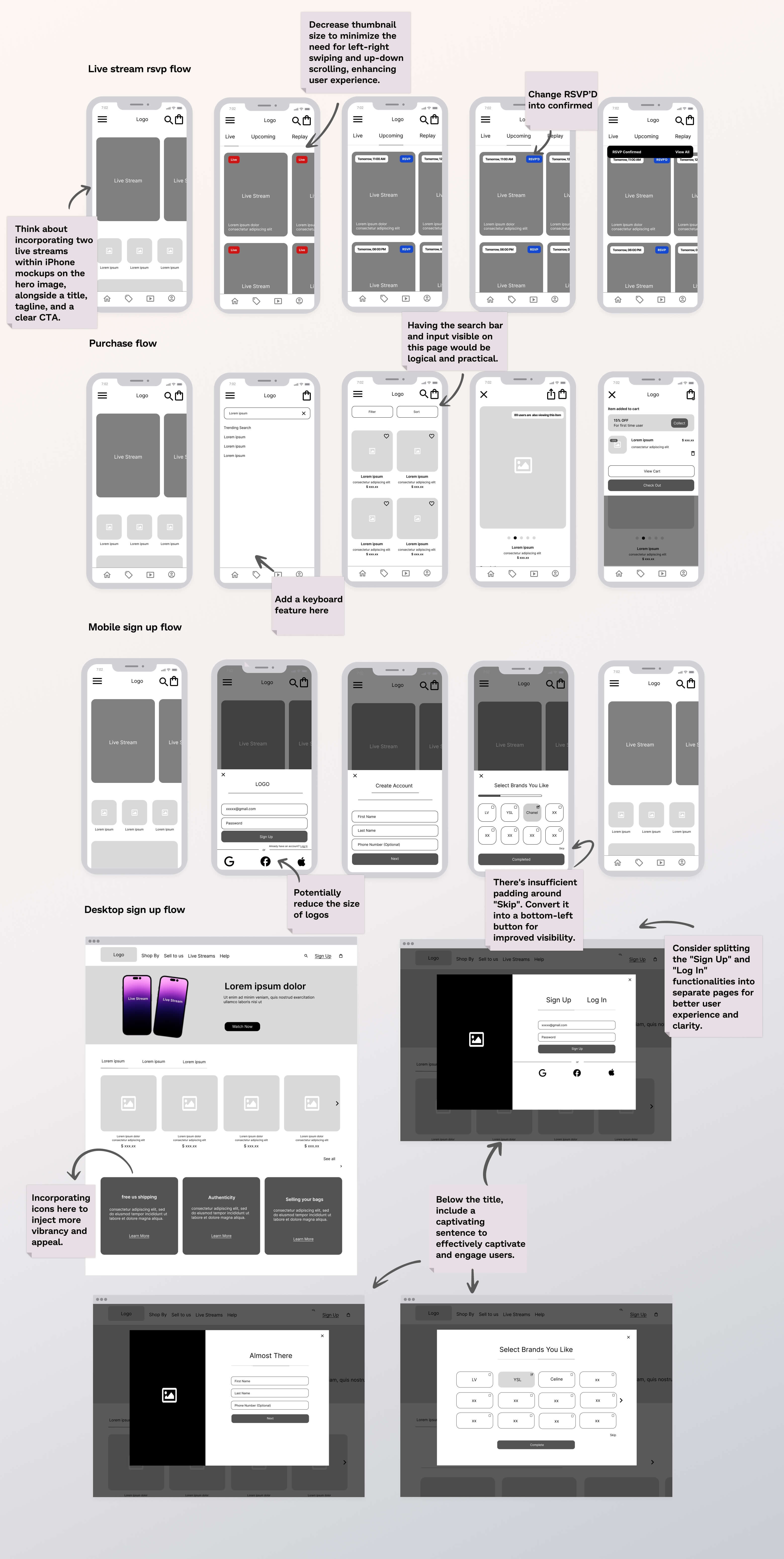
Wireframes
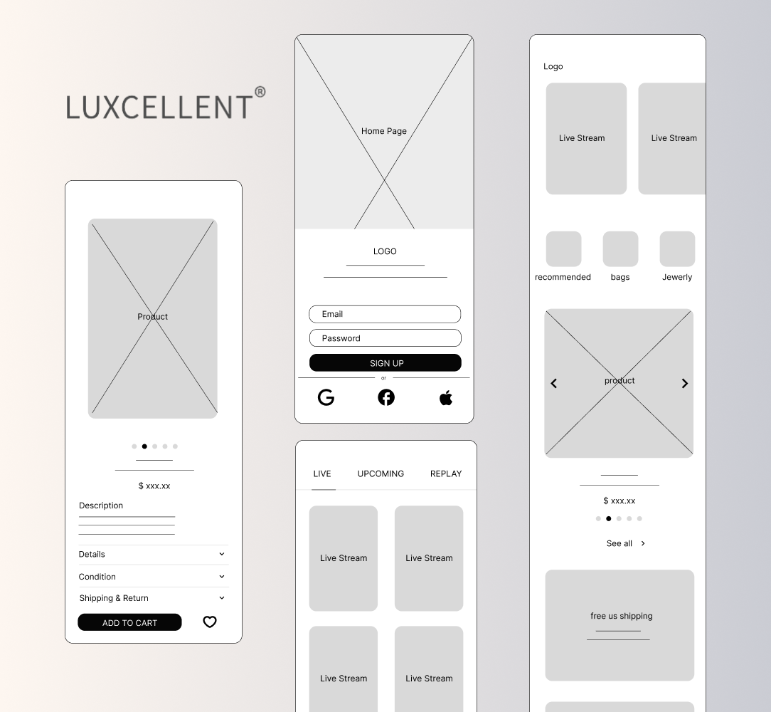
Based on my low-fidelity wireframes, I was able to transfer them into mid-fidelity using Figma. I had the basic layout set up and it helps me build into the next step which is high-fidelity wireframes.
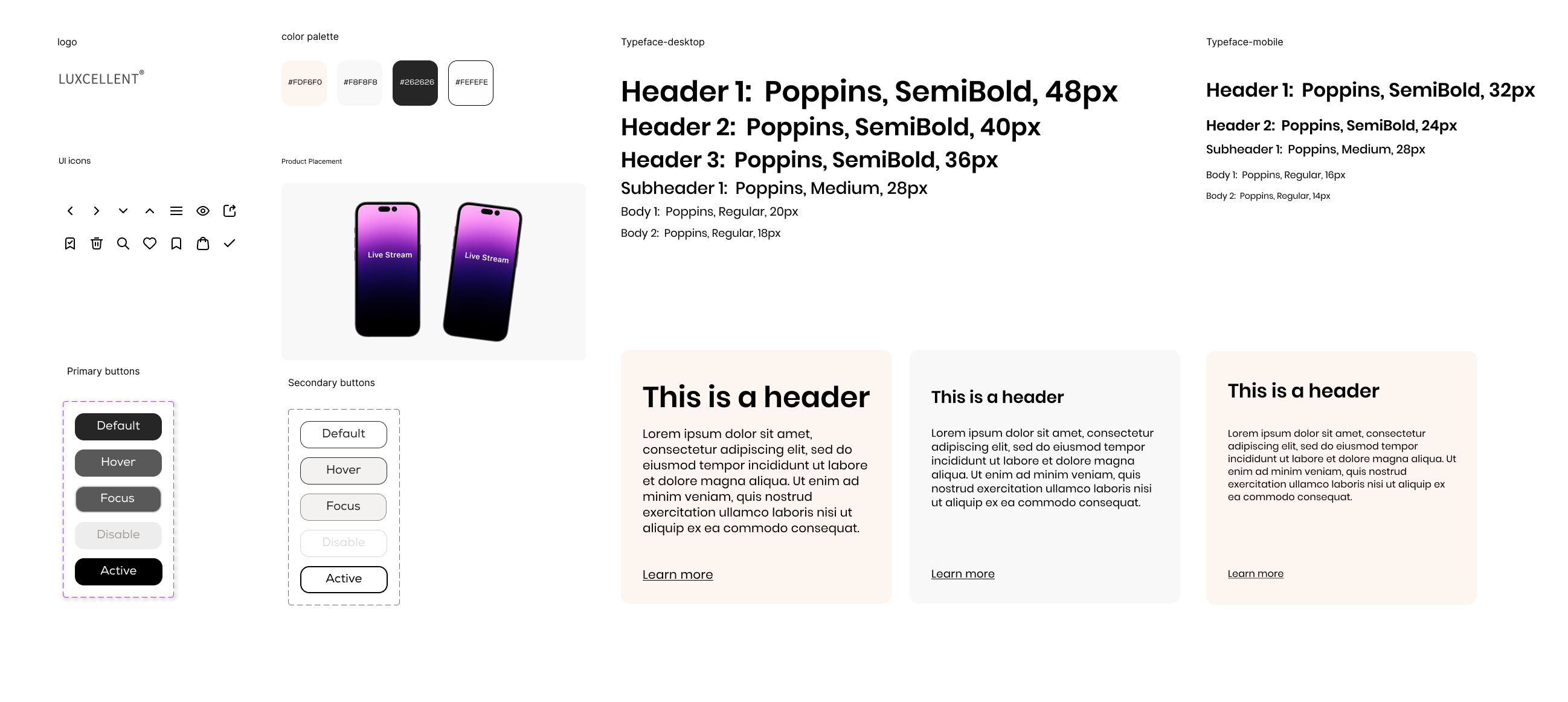
UI + Interaction Principles
The stakeholders wanted a clean and simple design. Based on the mood board, I created a chic and premium look that reflects the brand’s luxury identity while keeping the interface easy to navigate.
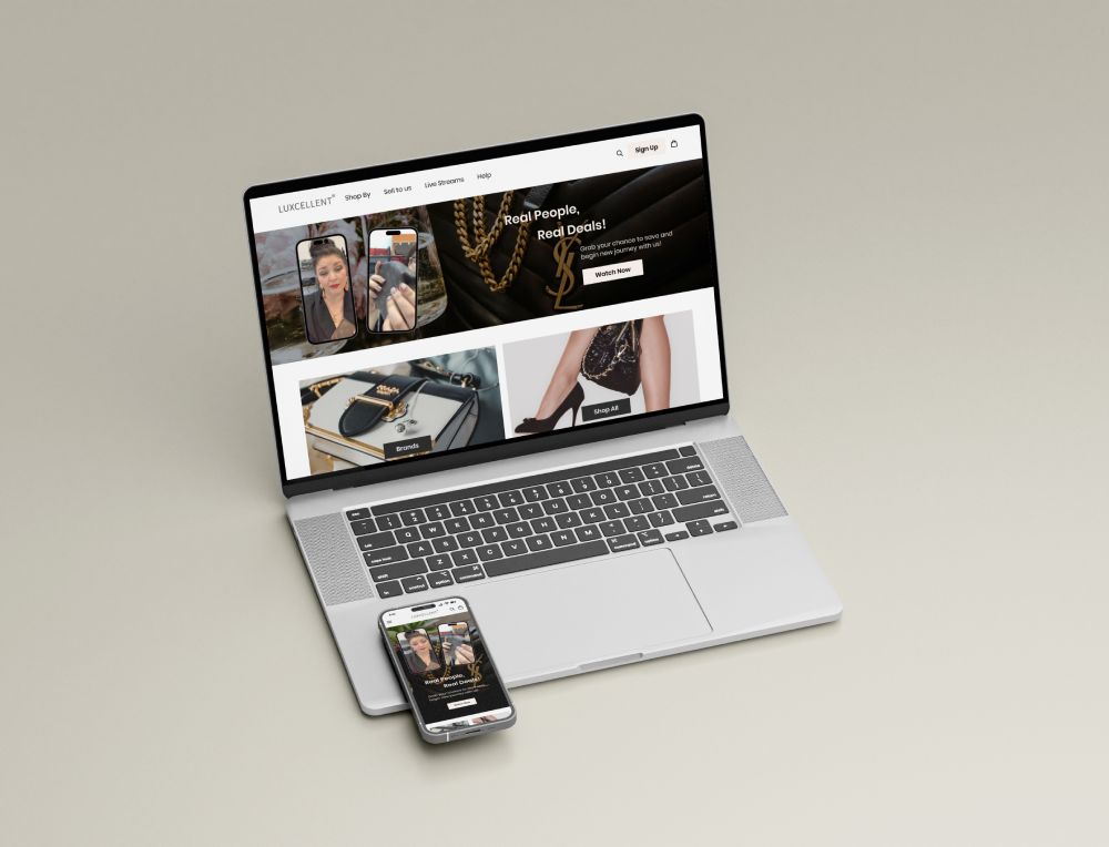
High fidelity designs
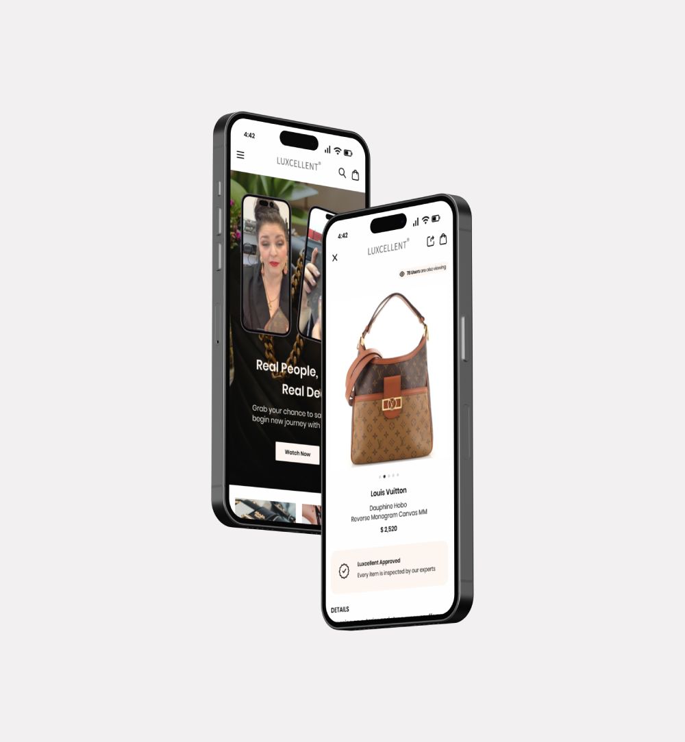
By applying my style tile and UI components to my design, the high-fidelity designs are completed. At this stage, the wireframes are defined enough for some user testing. The next step will be using these high-fidelity for prototypes.
04 Prototype
Usability testing
I created a fully-functional, high-fidelity prototype using Figma. At the same time, I started recruiting subjects for the test who fit my criteria. I had a total of 5 participants who provided very useful suggestions. Tasks were done remotely via Zoom and in person while notes were taken.
I organized the participants results into three different columns:
- Problem encountered
- Comments
- Changes to made
This list better helps me conduct results and makes things easier for my next step-analyzing results.
Analyzing usability results
I used Moscow to decide which changes are important for me to do.
Finding summary:
- All participants were able to finish the tasks
- All participants think the design is clear and straightforward
- All participants were able to finish both tasks within 5mins
- 60% of participants chose to click on the live stream button for task 1 rsvp upcoming streams flow
- Only 40% of participants chose to click on the search bar first for task 2 purchase flow
- 100% of participants know where to go for task 3&4
Prototype iterations
The Iterations I decided to make were must have and should have in MoSCoW. Based on issues experienced by most participants, I have made revisions under Must Have and Should Have:
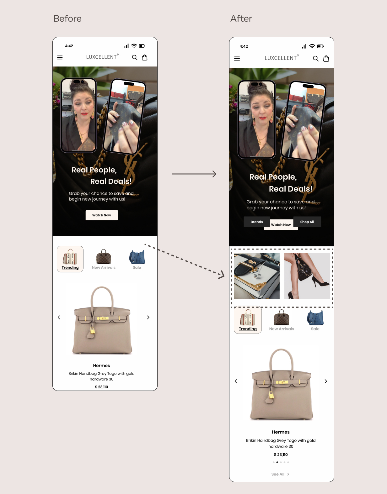
- Add more sections like brands on the home page
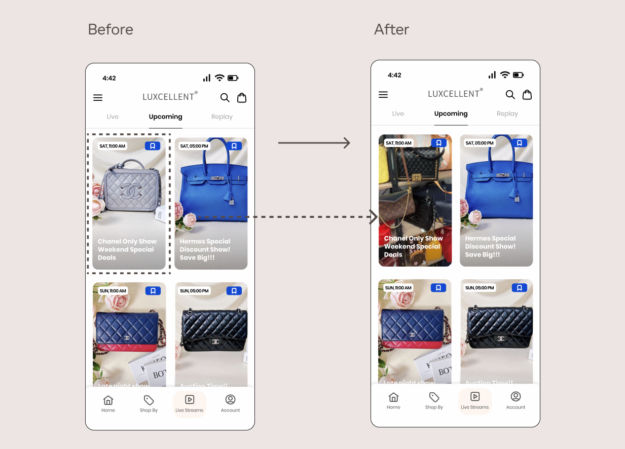
- Adding more upcoming live stream detailed information (preview) before the rsvp action
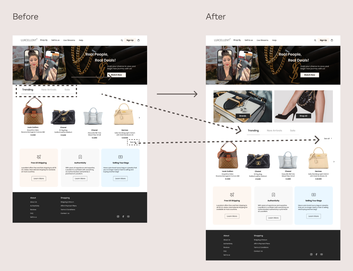
- Extend trending/sale/new arrivals more on the desktop version
- Change the sentence to better assist you with the items you like
- Change color on 78 users are viewing this item
- Remove or reposition the description text under free us shipping on the desktop version
- Move see all button to the top of the product
- Change rsvp to reserve or icon
Issue#1: Users are not seeing enough products on home page.
Solution: Adding brands and shop all categories on home page.
Issue #2: Users want to see more details for the livestream before they reserve.
Solution: Adding preview before reserve action.
Issue#3: Trending/New Arrivals/ Sale looks incomplete, causes confusions.
Solution:Extend them to the middle
Issue#4: “See all“ button is not noticeable enough.
Solution: Move it to the top of the products

05 Final Designs
06 Reflection
Working on this project with a real stakeholder was a valuable experience. It taught me the importance of listening carefully and understanding both business goals and user needs. I improved how I run interviews and turn feedback into clear insights that guide design decisions. This project also helped me see how design clarity and responsiveness can make interactions feel more natural and align better with the overall brand experience. These lessons will help me work more efficiently and design with more intention in future projects.