ActiveX
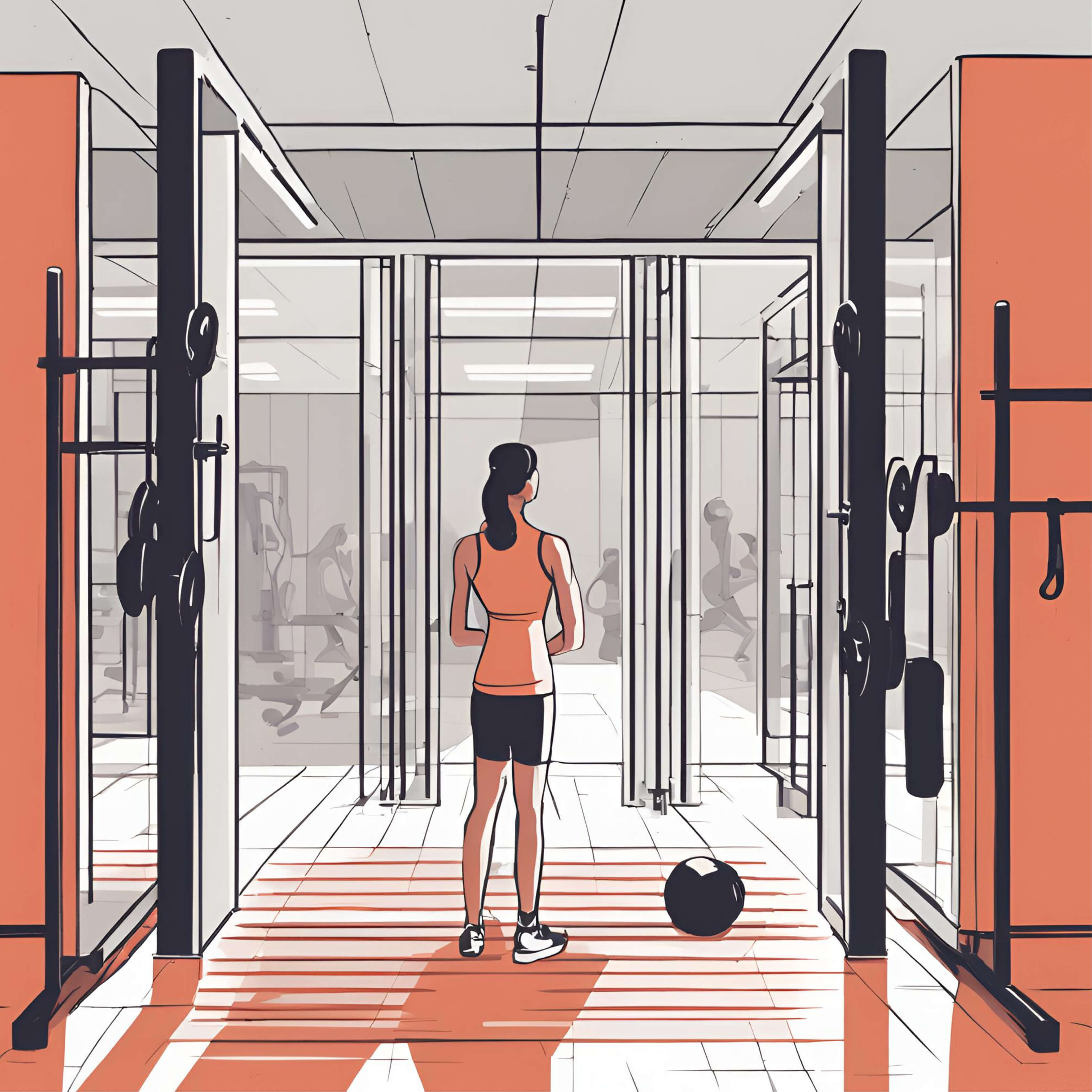
ActiveX is launching a fitness app for people who feel intimidated working out around others. The app offers guided workouts and tutorials, helping users confidently exercise on their own at home or in the gym. This project looks at how small interactions and personalized feedback can help people feel more confident and consistent in their workouts.
General info
Problem
Statement
&
Goals
Problem statement
- How do we find the best workout plan for people who are insecure and afraid of working out at the gym, and find a way to keep them on track so they don't give up in the middle?
High-Level Design Goals and Objective
Design Focus: help users feel confident through clear guidance, friendly interactions, and an easy onboarding flow that removes pressure and keeps them motivated.
- Create a new brand for the mobile app
- Create the MVP Flows for the following features
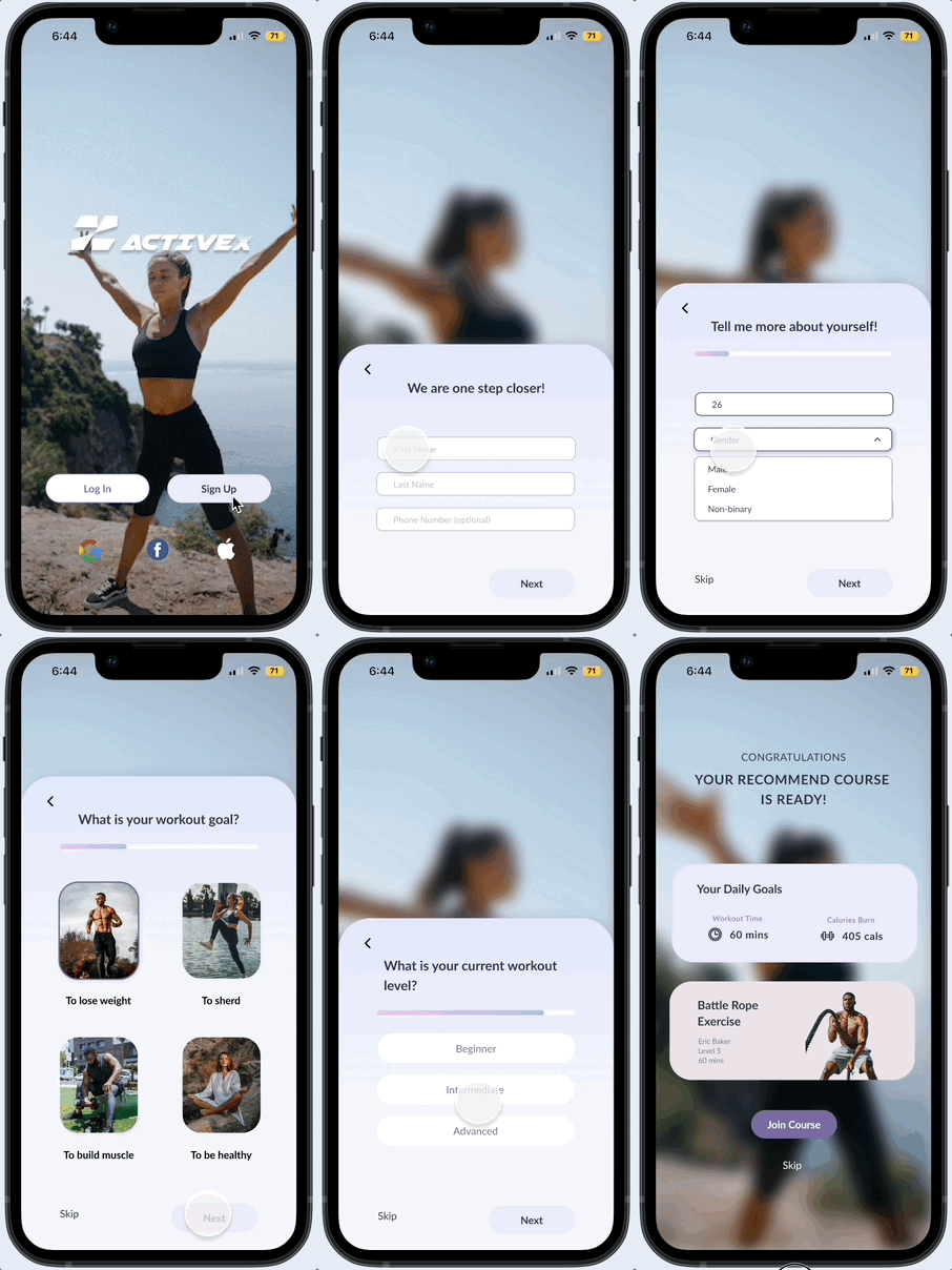
- Sign-up with Fitness Quiz / Assessment
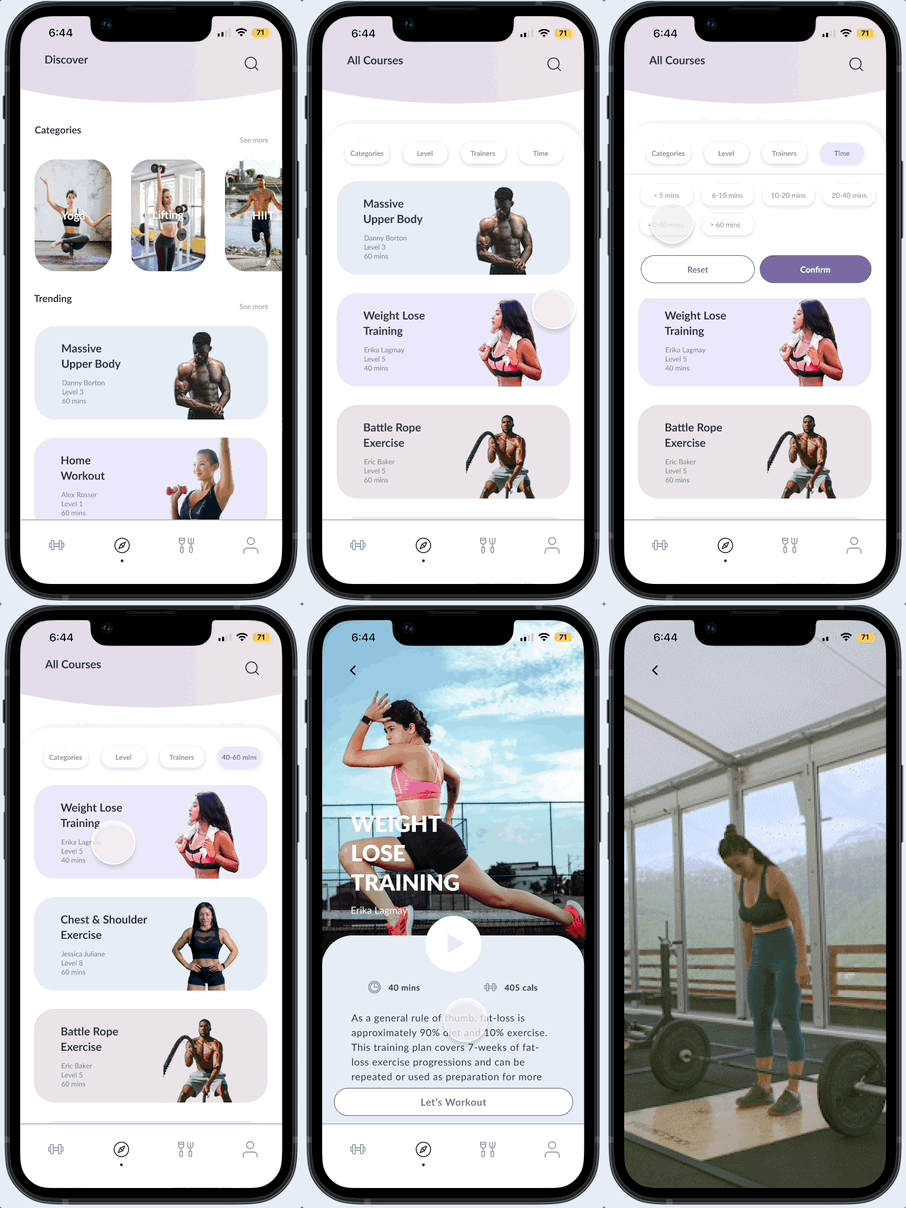
- Choose a workout
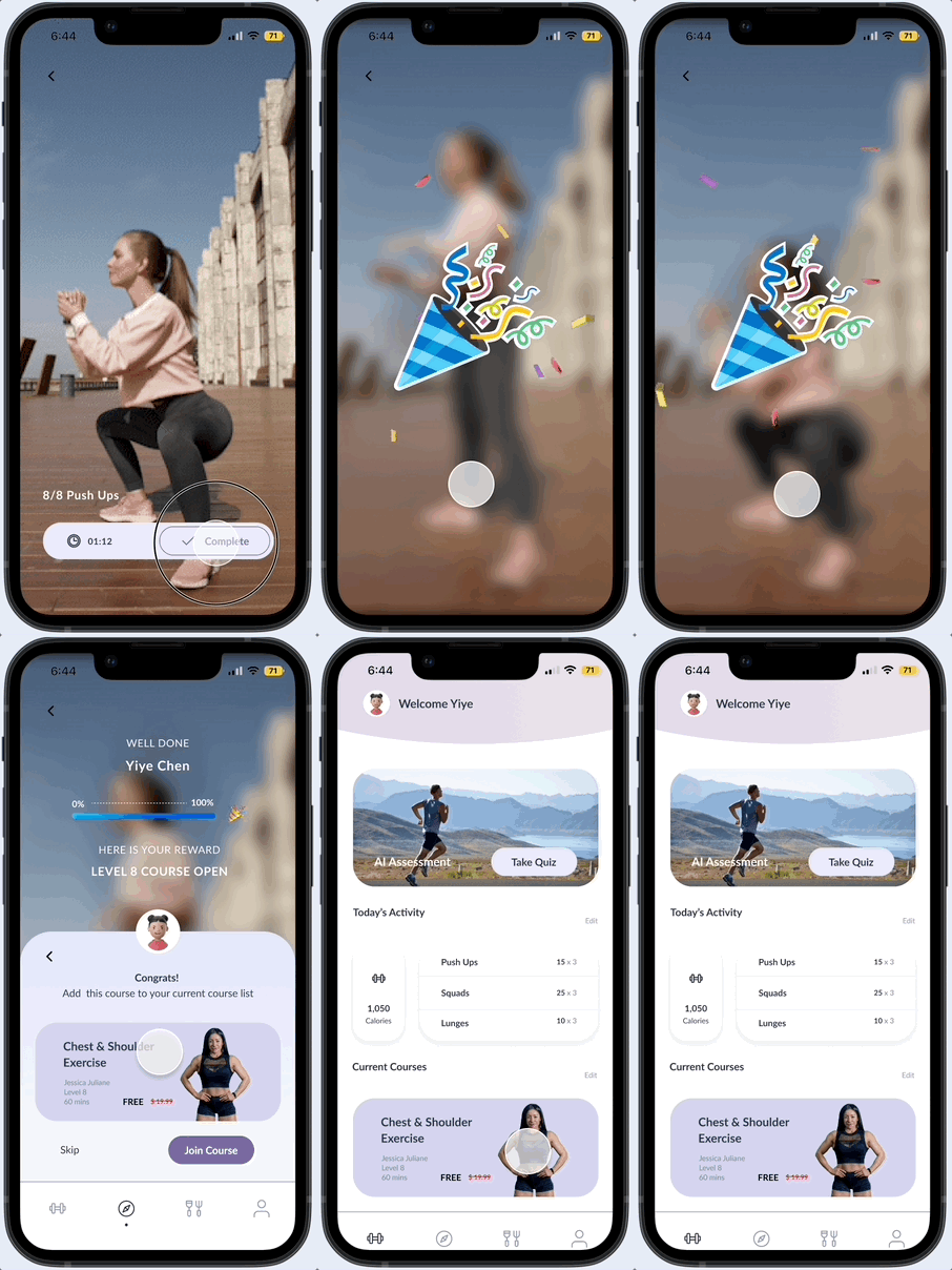
- Rewards/ Progress tracking
01 Research
Research plan
I decided to use competitive analysis and user interviews for research methodologies. I selected these two methods to help me understand how existing fitness apps approach motivation and engagement and directly explore users’ needs, goals, and pain points, allowing me to craft a more empathetic, human-centered interactive solution.
Competitive analysis
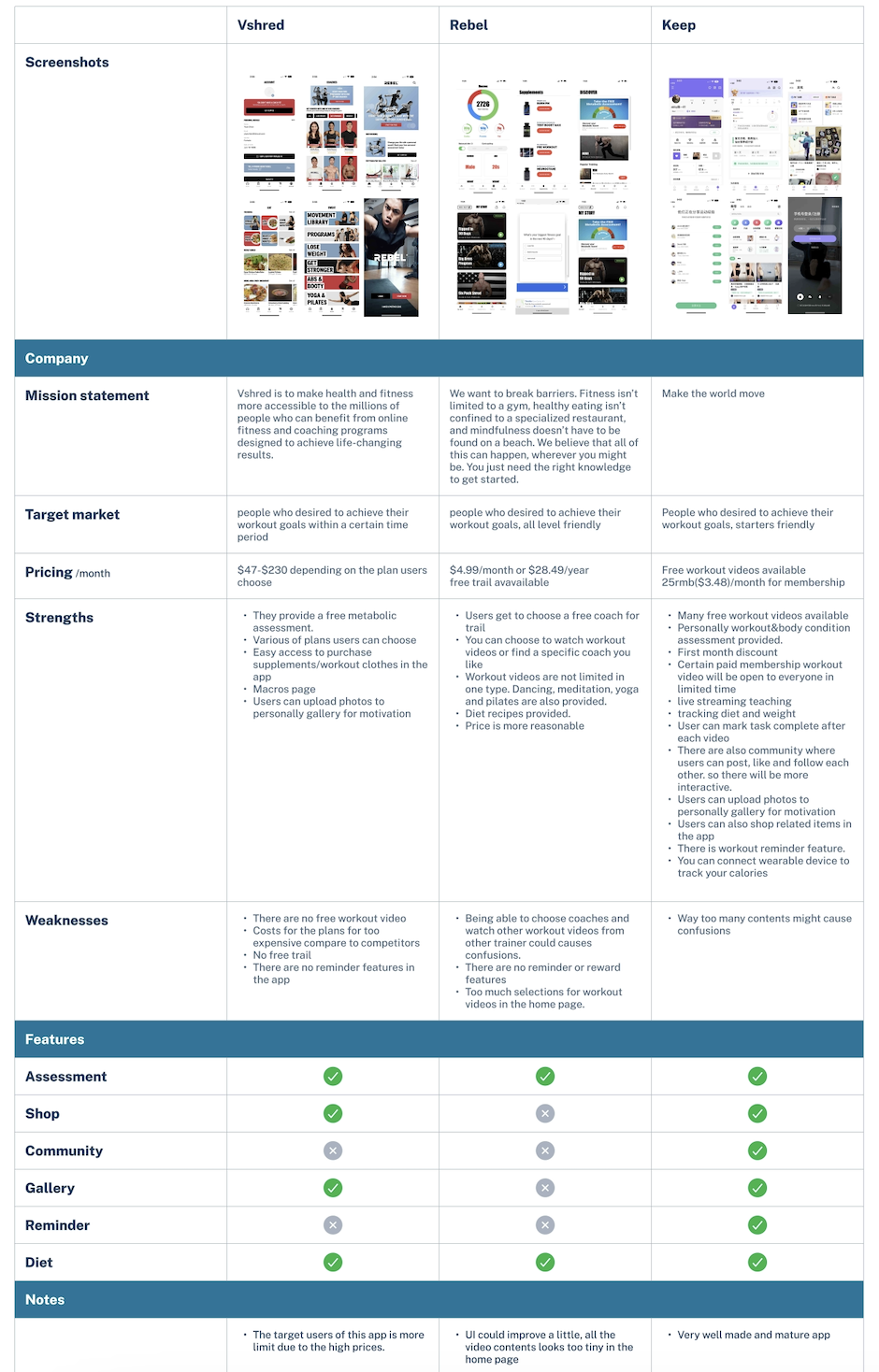
By researching similar fitness apps in states and also in foreign countries to compare the features and services they provide. By doing this, I have discovered through research:
- Most apps limit access to certain features, restricting users.
- 100% of our competitors offer assessments and diet features, which we should consider incorporating.
User interviews
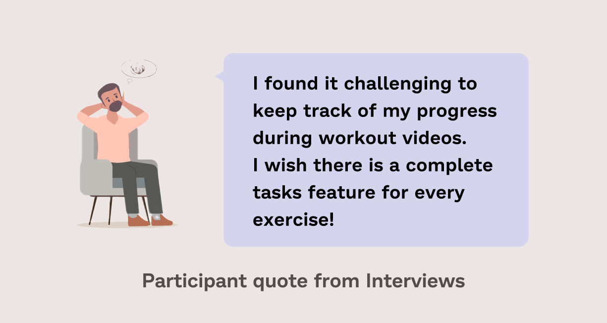
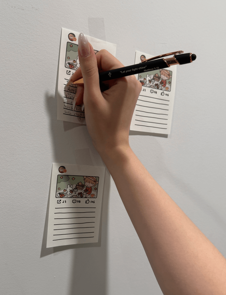
I prepared an interview script with 7 open-ended questions, focusing on our target audience’s needs, goals, and pain points. Within 2 days, I successfully recruited and conducted interviews with 5 individuals who have either used fitness apps or attempted to but discontinued their usage, both remotely and in person. Next step, I created affinity mapping to better help me build up research findings.
Affinity mapping
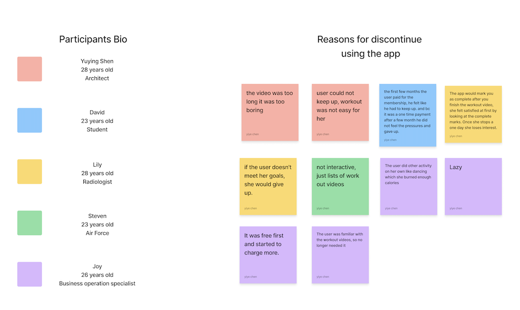
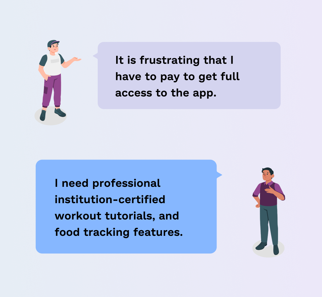
I compiled all interview feedback into an affinity map, helping my understanding of user pain points, goals, reasons for app discontinuation, and signup question design. Through this process, I identified that users' primary pain point comes from the necessity to pay for full app access, alongside a strong demand for certified workout tutorials and food tracking features.
Research Insights → Design Direction
Users were frustrated that they had to pay to access the full app → I decided to create a content unlocking system where users gain access to more content as they complete additional workout videos, helping users stay motivated without feeling restricted.
Users' top priority is professional institution-certified workout tutorials → planned to add filters to let them choose professional coaches
Flows will be designed:
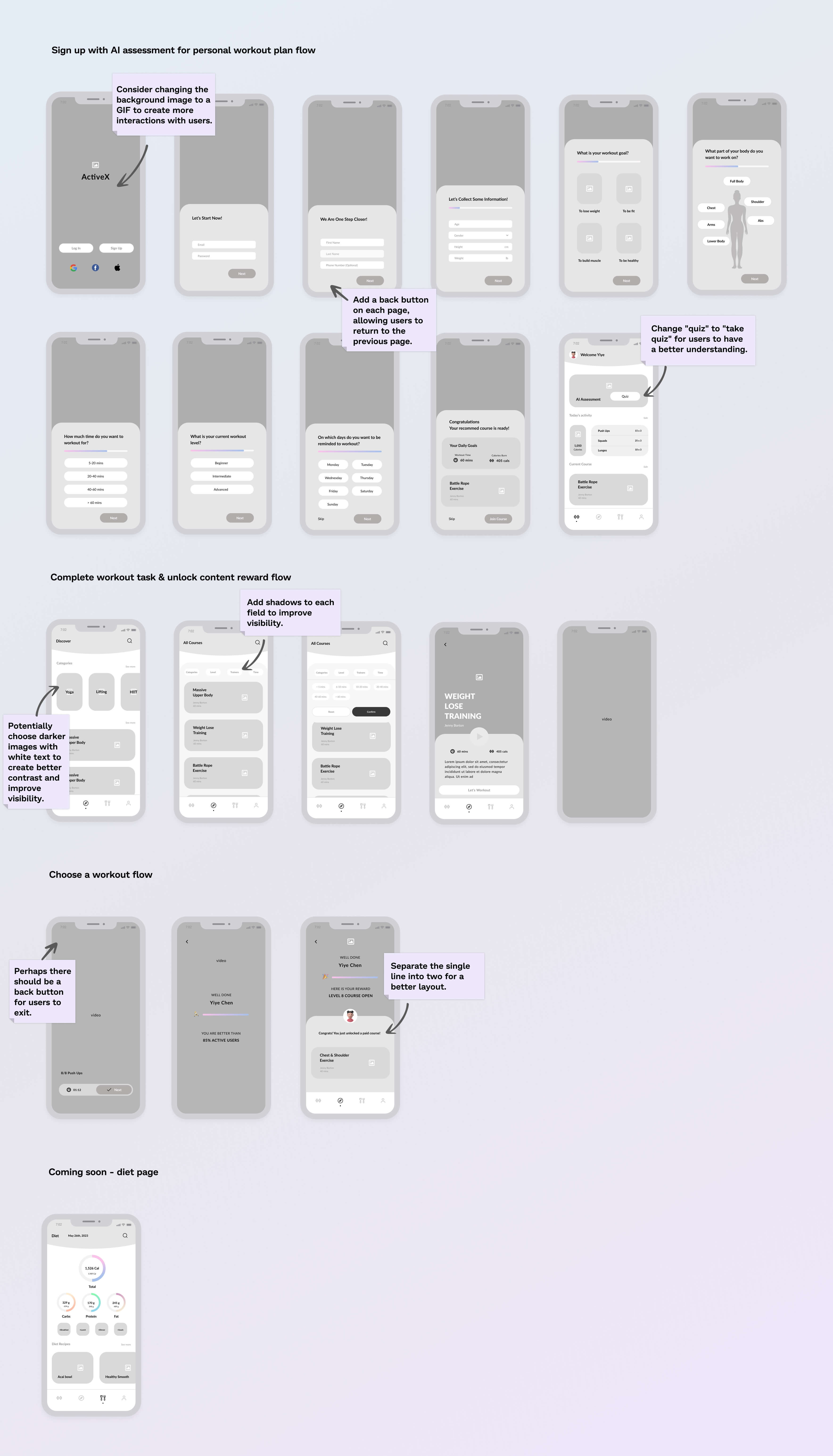
- Sign up with AI assessment for personal workout plan flow
- Unlock content reward flow
- Choose a workout flow
02 Ideate
Personas
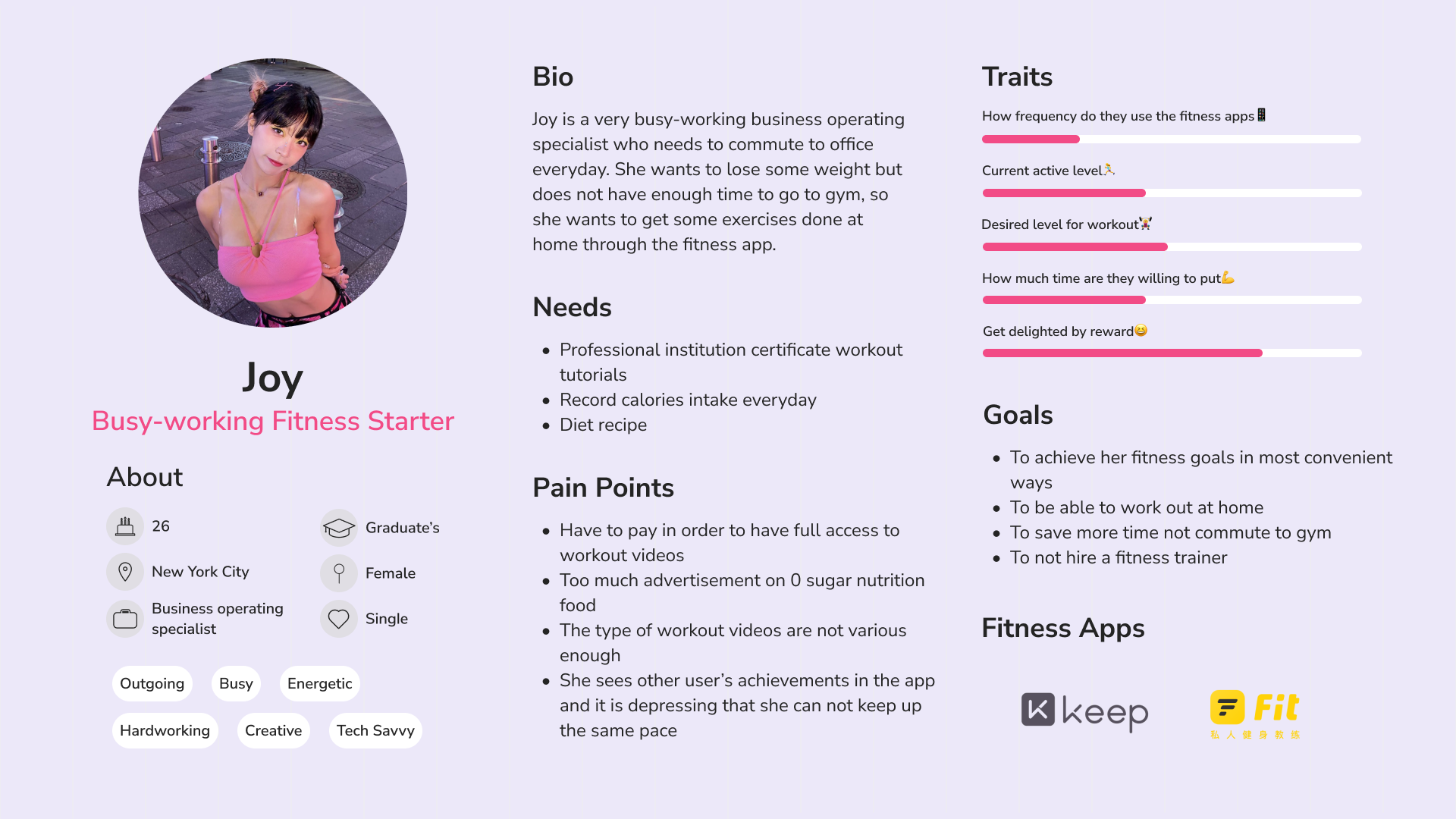
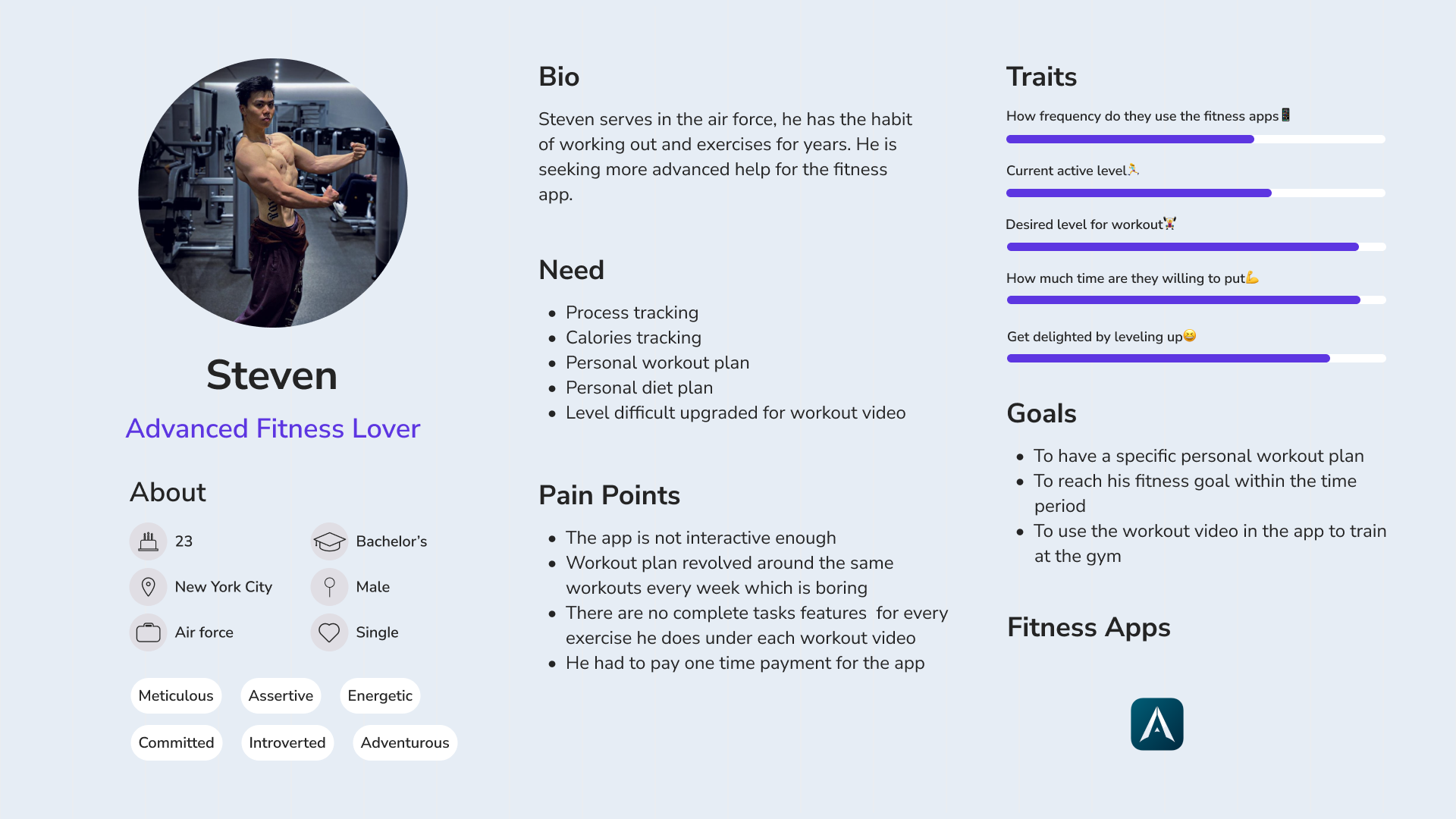
I created 2 personas to form a deeper understanding of our user's goals, needs, experiences and behaviors. These 2 personas represent two types of groups.
- The first groups are busy working people who are new to workout and want to have easy access to workout videos, and also be able to work out anywhere.
- The other types of people are advanced workout lovers who need more specific workout plans and can make progress.
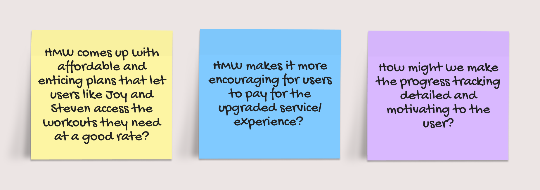
How might we statement
To get started in forming solutions, I used a “how might we…” framework centered around the user and business goals.
POV statement
Based on my understanding of my users’ needs and my insights about them, I used POV statements to help me define the problems.
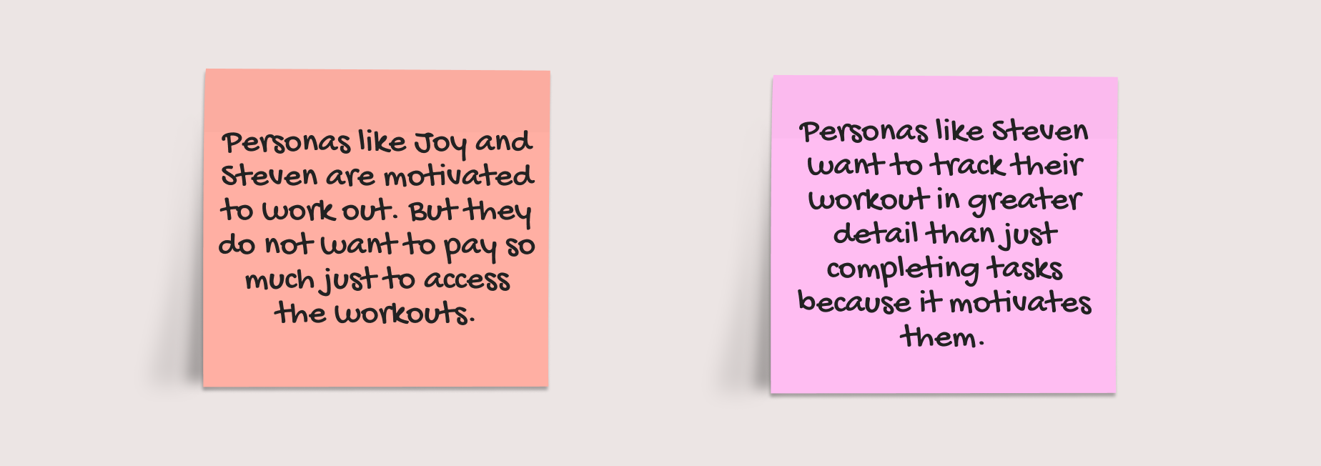
Additional Insights → Actions
Users needed better progress tracking to stay on track with their goals → I decided to add a "complete task" feature for each exercise, which will be part of the new complete workout task & unlock content reward flow.
Users showed strong interest in food tracking → I decided to include a diet page to support their fitness and nutrition goals.
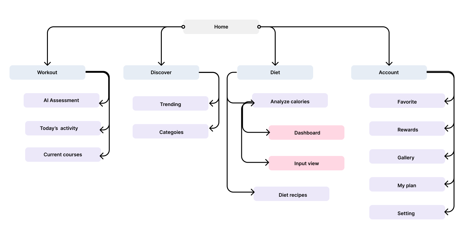
Sitemap
Based on the insights I have collected, I have organized the contents into a sitemap. This better helps me design my users flow and task flows.
Task flow
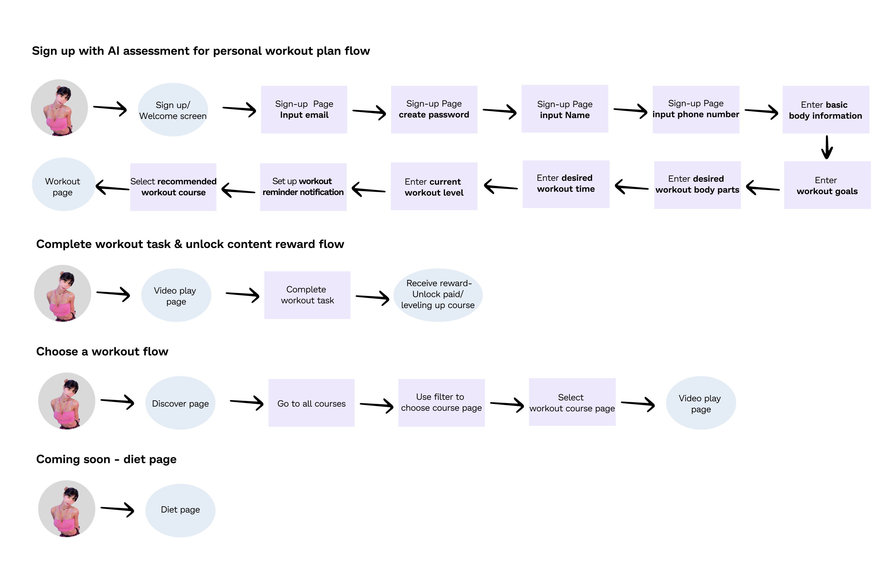
The flows I will design based on the user's pain point are:
- Sign up with AI assessment for personal workout plan flow
- Complete workout task & unlock content reward flow
- Choose a workout flow
- Coming soon - diet page
03 Design
Wireframes
Based on my sketches, I transferred them into wireframes in Figma. I also left notes on areas for improvement for the high-fidelity wireframes.
UI + Interaction Principles
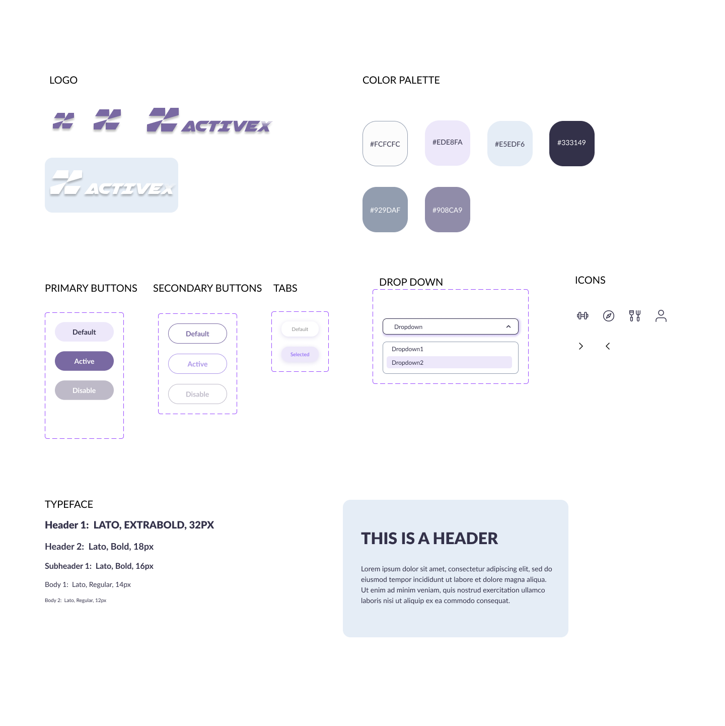
Based on my research, I noticed many apps use intense, contrasting colors in their designs. While my target users include bodybuilders and anyone interested in fitness, I aim to maintain a relaxed, stress-free vibe. Therefore, I chose not to incorporate too many intense colors into this app. Neutral colors and light gradients keep the layout clean, while accent shades guide attention to progress and confirmation moments. The type and spacing make information easy to read at a glance, even during movement.
Interaction Flows
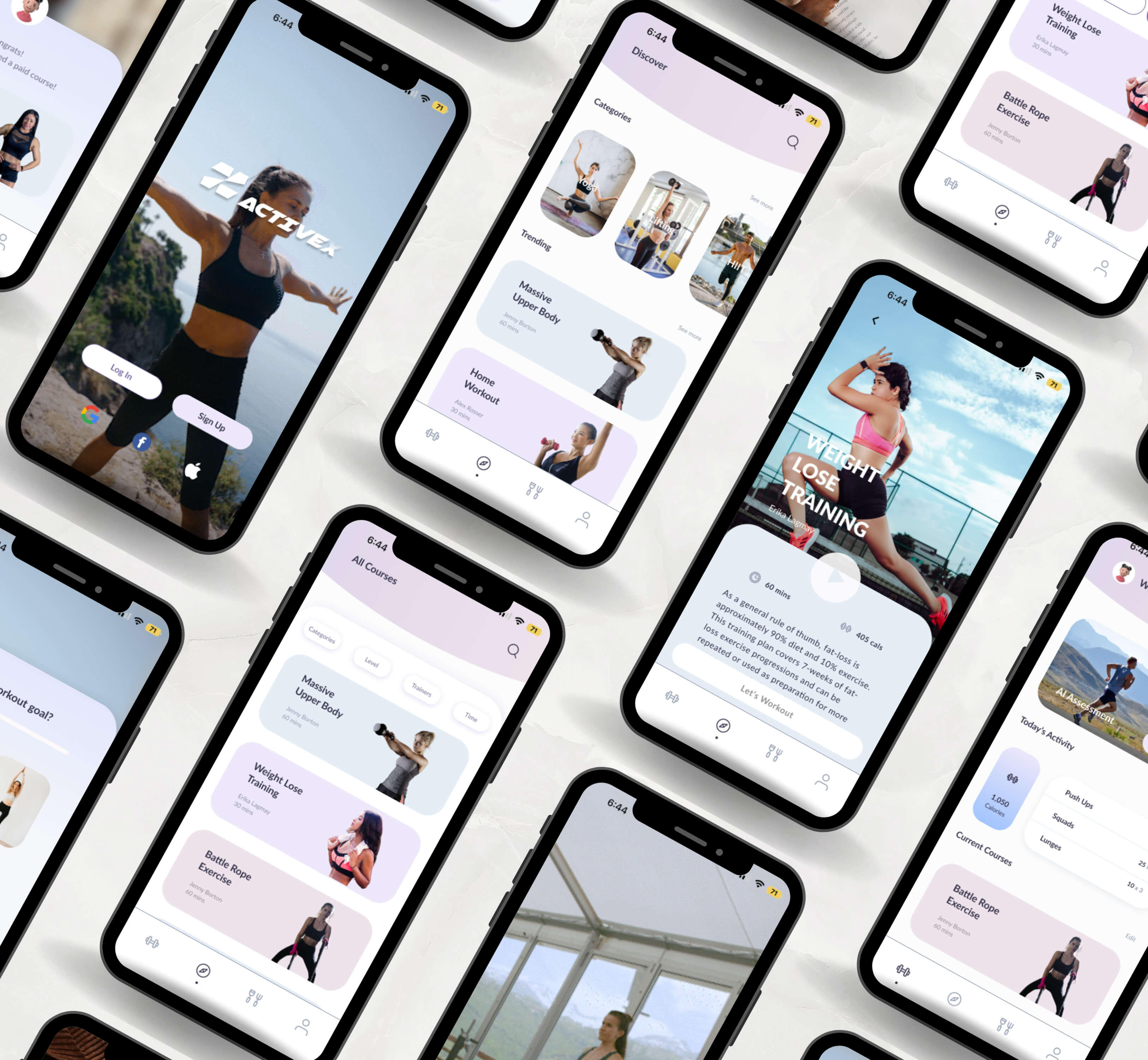
By applying my style tile and UI components to my design, the interaction flows are completed. Mapping how users navigate, respond, and complete key actions within ActiveX. At this stage, the wireframes are defined enough for some user testing. The next step will be using these high-fidelity prototypes.
04 Prototype
Usability testing and analyzing results
I created a high-fidelity Figma prototype and tested it with 5 participants. Sessions were conducted via Zoom and in person. Feedback was organized into three columns: Problems, Comments, and Proposed Changes.
I used the MoSCoW method to prioritize necessary changes.
Finding summaries:
- 100% of participants were able to finish the tasks
- 100% of participants think the design is clear and the flow made sense
- 100% of participants think the number of questions was good.
- 100% of participants were able to finish the task within 3 minutes
- 100% of participants had no problem encountering the sign-up flow.
Prototype iterations
The Iterations I decided to make were must have and should have in MoSCoW.
Based on issues experienced by most participants, I have made revisions under Must Have and Should Have:
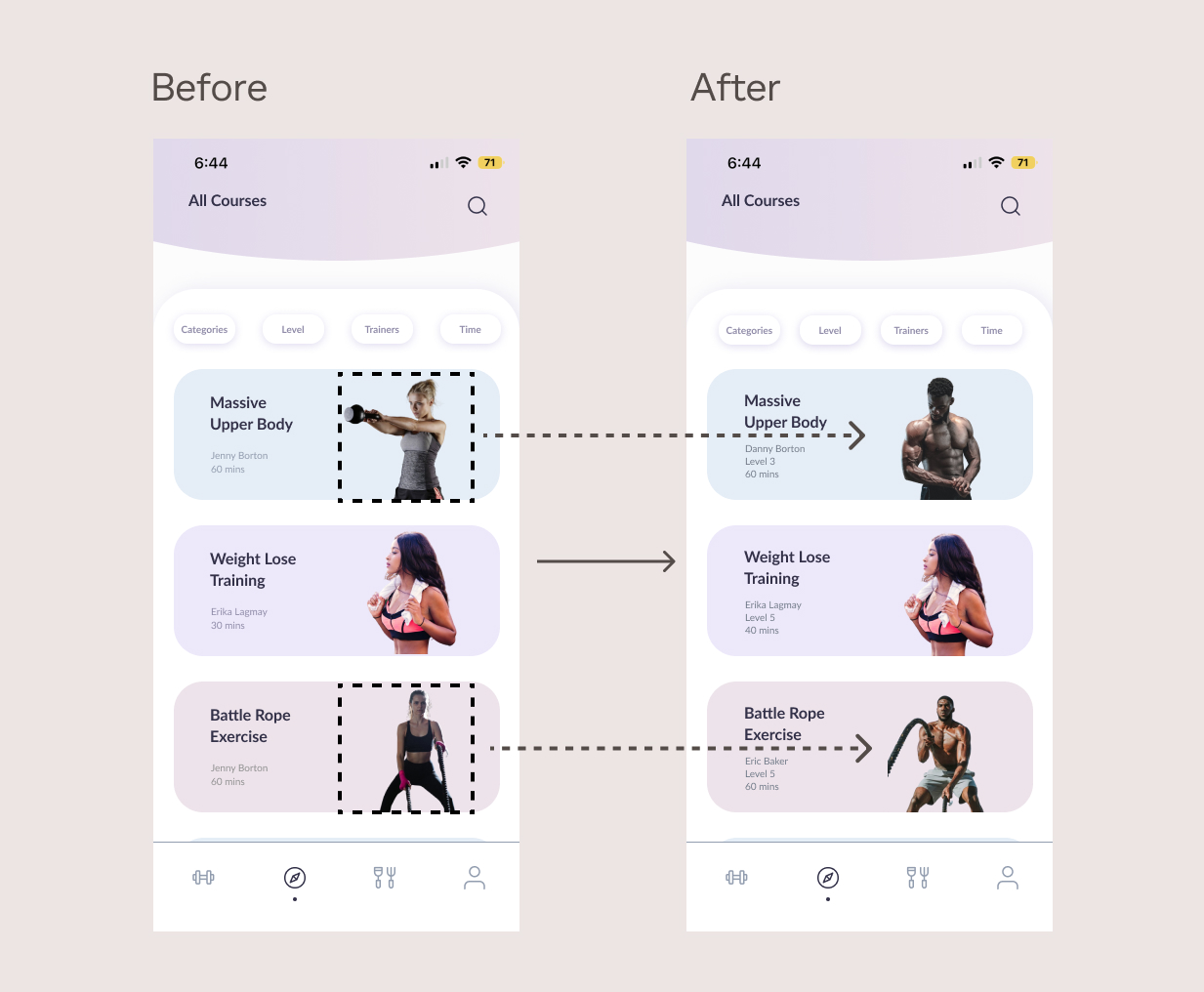
Issue #1: Male participants feel the app is primarily designed for females, not for bodybuilders.
Solution: Adding more males photos to the app
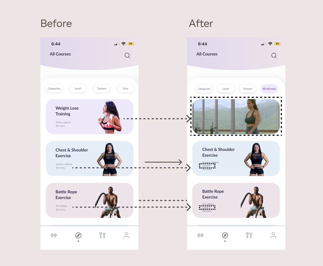
Issue #2: Users are spending too much time on selecting course.
Solution: Adding levels and preview of highlight footage to course to help users make better selections.
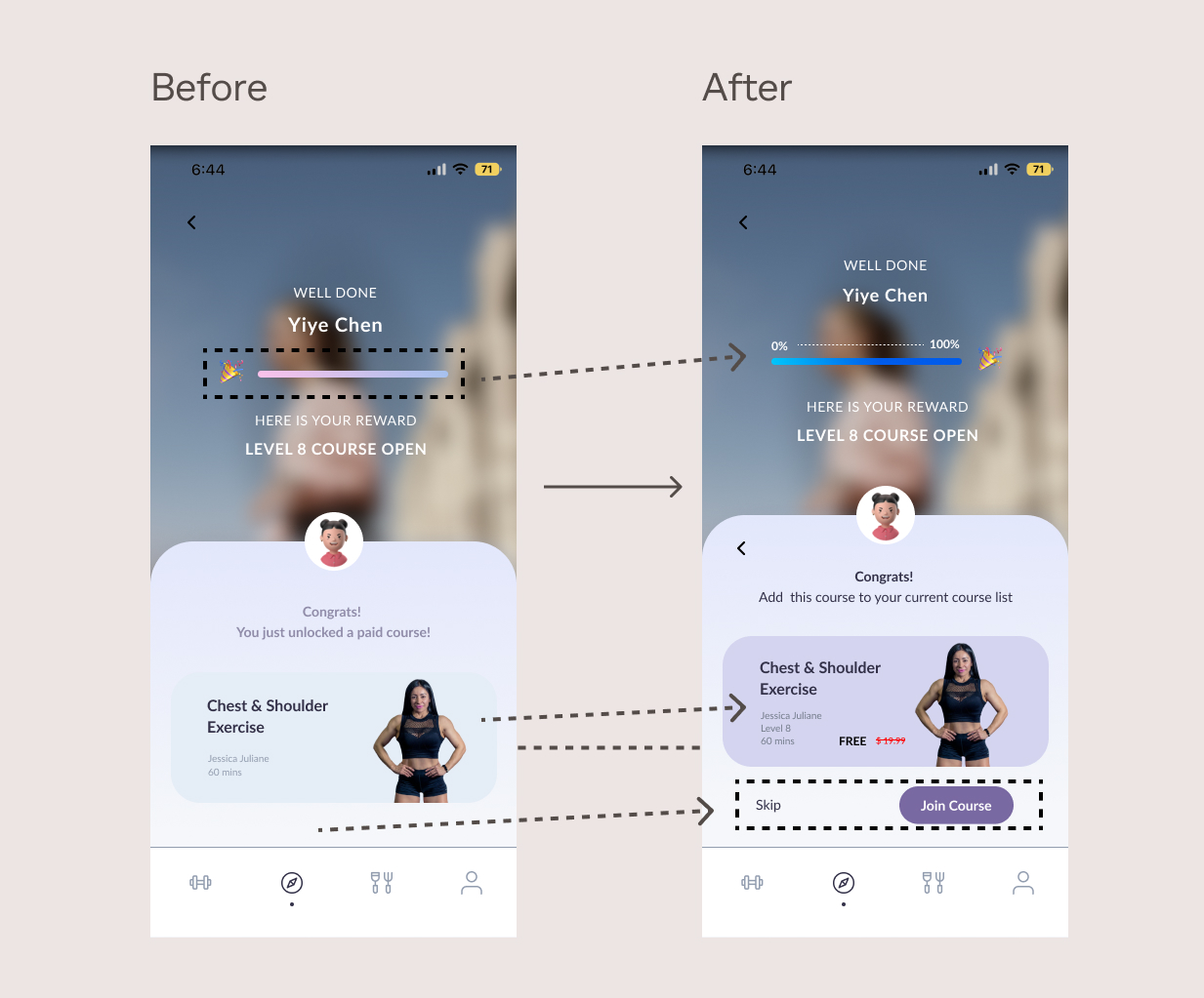
Issue#3: The progress bar feels unclear and could use improvement.
Solution: Move emoji to the right, and add 0-100% on top.
Issue#4: User does not have the option to skip adding the course unless they go back to previous page.
Solution: Adding “skip” and “join course” buttons.
Issue#5: The text and background color of the course have poor visibility.
Solution: Adjust the color of texts and background color, add the original price in red, crossed out, with "Free" next to it.
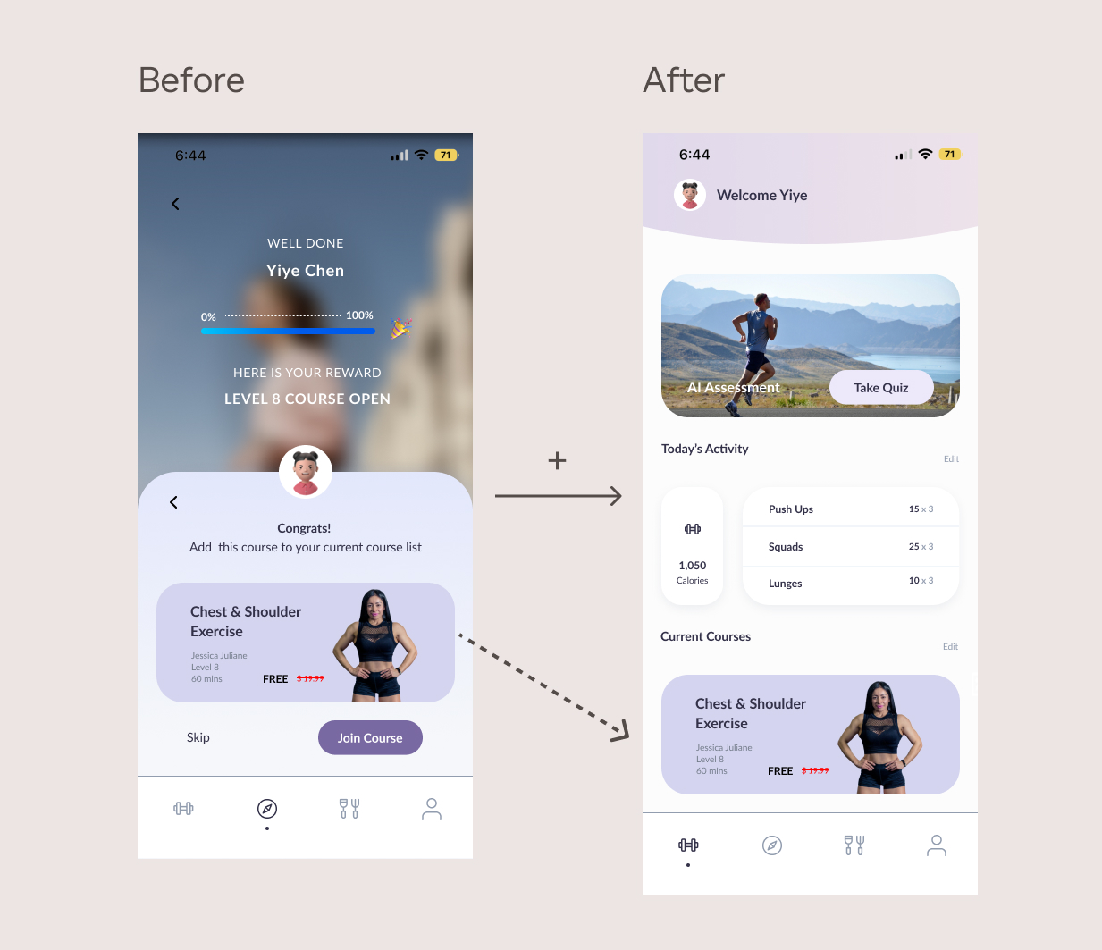
Issue#5: Complete workout task & unlock content reward flow feels uncompleted.
Solution: Adding the workout page for the last page where users can check the most recently added reward courses.
Final prototype
After working on the iterations from the user testing phase, the final prototype is now complete. Here is how people interact with what I designed.

05 Final Designs
06 Reflection
This was my first time designing a full interactive experience on my own. I used everything I’ve learned so far and enjoyed exploring how small interactions and motion feedback can influence motivation. One challenge was that users spent too much time choosing courses, so I added levels and short highlight previews to help them decide faster. This project showed me how the right interactions can make the experience feel effortless. I’m excited to keep improving and exploring new ways to make interactions feel smoother and more engaging.